Home Page Placement Strategy

SnappTrip

Overview

The SnappTrip home surfaces different products — Flights, Hotels, Train, Bus, and etc. Two new features needed a home: Book Draft, which recovers an abandoned booking, and Upcoming Trip, which re-engages travellers with active trips.

Main problem: the purpose of this study was to decide exactly where each new feature should live on the home page, without hurting the primary Search conversion.

This resulted in:

  • Aligning stakeholders around a single, shared idea
  • Reducing the extra spacing inside the Search box
  • Making sure nothing sits on the Search button, since that hurts conversion (CR)
  • Recovers an abandoned booking
  • Re-engages travellers with active trips.

Role

User research
User experience design
User interface design

Tools

Figma, FigJam, Claude Design, ChatGPT, Grok, Copilot

Team

  • 1 Product Designer (me)
  • 1 Product Manager
  • 2 Engineer

The visible screen is smaller than it looks

About 18% of devices report a 740–760px viewport. Once the status bar, system navigation bar and gesture area (~90px) are subtracted, actual visible content is meaningfully less — an estimated 650px or less. The current home already fills ~714px with header, search and recent searches, leaving little to no space below the fold.

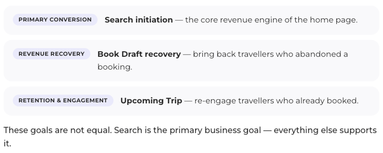
One screen, three competing goals — not equal​

How Competitors Place Key Features

Benchmarked home-page patterns across major OTAs:

OTA Home Hero Search Upcoming Trips Book Draft Interrupts Search?
Booking.com Search hero + product tab Top hero home / Bottom nav "Trips" tab / Upcoming card at home Book draft card at home No
Airbnb Search bar + product tab Search bar home / Bottom nav "Trips" tab / Upcoming card at home Book draft card at home No
Expedia Products + feature promotions Bottom nav "Trips" tab / Upcoming card at home Book draft card at home No
Trip.com Search + products Top of home "Trips" tab / Upcoming card at home Book draft card at result page No
Hopper Search bar + product tab Top of home My Trips inside profile – No
MakeMyTrip Product tabs . Offers Inner page "Trips" tab – No
Agoda Search hero Top hero My Trips inside profile Book draft card at home No
Alibaba.ir Products Inner page "Trips" tab / Upcoming card at home – No
Flytoday.ir Products Bottom nav "Trips" tab / Upcoming card at home – No

No major OTA places Upcoming Trip above the primary Search module.

Placement ideas explored

Every placement option, scored

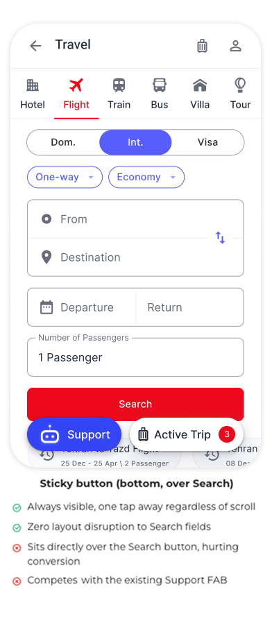
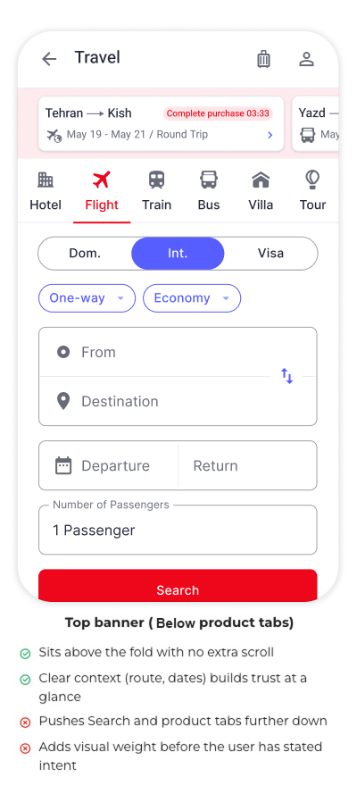
We tested nine ways to place “Upcoming” and “Draft” content and scored each on search conversion, revenue, retention, and cognitive load. Putting new content above Search consistently hurt conversion and raised cognitive load, so that approach was ruled out. Other placements — like a badge, a sticky button, or showing the draft inside Search — each improved one metric while weakening another. Contextual rendering was the only option that scored well across conversion, revenue, and retention while keeping cognitive load low, making it the clear recommendation.

Four techniques — start with a compact Search module

01
Peek / Peeking UI
Design the Upcoming Trip card so its top edge (~25–30px) peeks out below the Search module — a strong scroll cue (up to +75% awareness).
02
Compact Search Module
Consolidate fields into a single compact row + CTA, pushing Upcoming Trip fully above the fold — the foundational fix.
03
Motion Hint (one-time only)
On first load, animate the Upcoming Trip card with a subtle bounce or slide-in, once per session (+20–30% awareness).
04
Notification Badge in Header
Add a small dot or number badge to the Trips icon whenever the user has an upcoming trip — zero viewport cost.

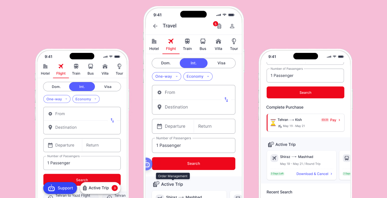
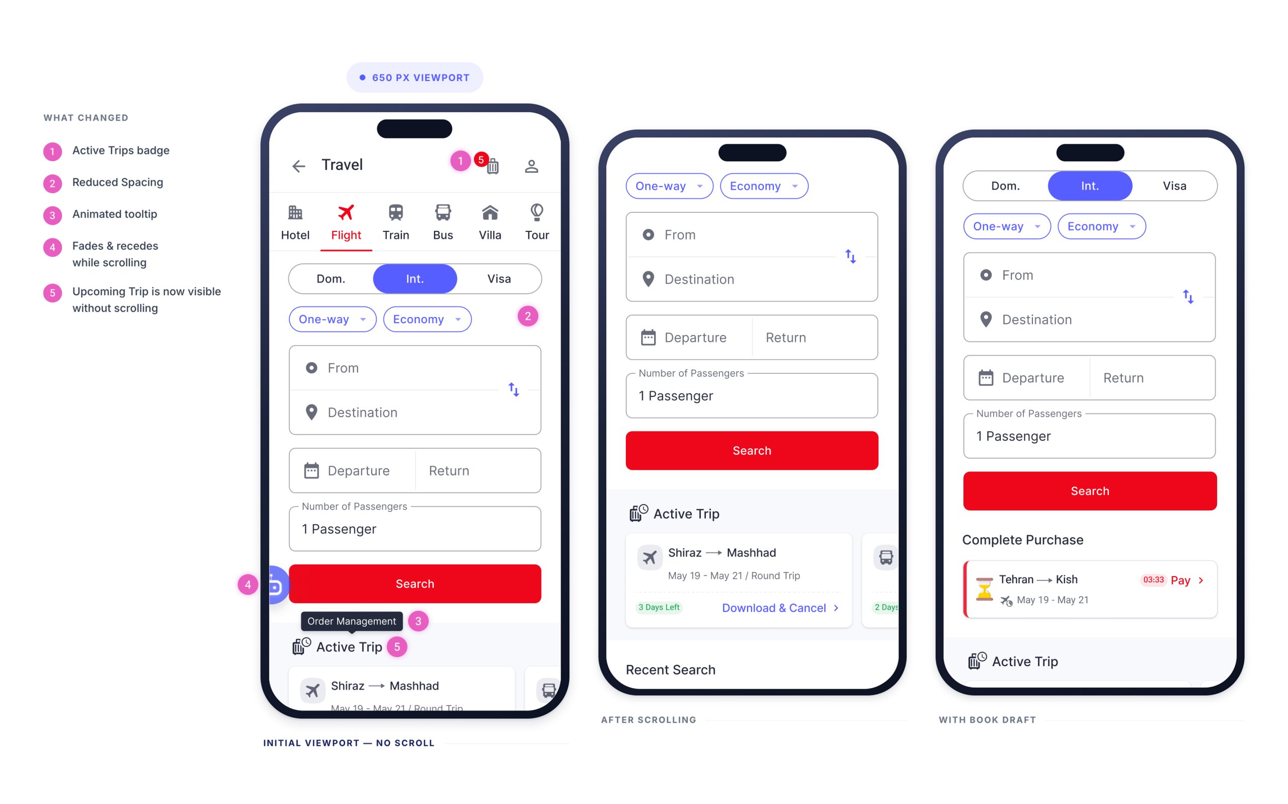
Reduced internal spacing in the Search module reclaimed enough vertical space for the Upcoming Trip section to surface within the first 650px.

Proposed MVP design

Reduced internal spacing in the Search module reclaimed enough vertical space for the Upcoming Trip section to surface within the first 650px.

The support button was dimmed/faded and moved to the side so it doesn’t overlap the search button.

Book Draft and Upcoming Trip now appear, in that order, below the search button and above Recent Search.

The placement of Book Draft needs A/B testing.

Recommended validation plan

Sequenced by value — later experiments depend on the design space earlier ones establish.

01 · Collapsed vs. Expanded Search

Run FIRST — determines the space budget for every card decision that follows.

Metrics: search-initiation rate, time-to-search, booking conversionGuardrail: first-time-user bounce rate, scroll depth
02 · Book Draft Placement

Banner below Search vs. inside Search vs. above Search, run after Exp. 1 is fixed.

Metrics: draft resume rate, completed bookingsGuardrail: fresh-search cannibalization rate
03 · Upcoming Trip Presence & Window

No card vs. contextual card; if card wins, test window lengths vs. ‘My Trips’ icon control.

Metrics: trip-page visits, engagement / CSATGuardrail: support-contact volume, dismissal rate

Run in parallel — analytics to instrument real base rates and confirm device/viewport distribution before quoting any fold figure; usability testing on collapsed-bar comprehension for first-time users and Draft-inside-Search vs. banner confusion risk.

What I Learned

Everything else supports it — search wins the first screen.

Validate a collapsed Search entry first — it may dissolve the entire fold conflict; ship a simple static Draft-above-Upcoming ordering below Search as an interim state; and invest in full context-aware personalisation only once base rates and eligibility signals justify the added complexity.

Next