Vela is an AI-first design system
Vela
Overview
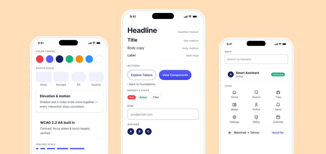
Vela is an AI-first design system platform. The same 63 components adapt through tokens — never forks — across shape, surface, brand, and eventually industry. Built to be read by designers, developers, and coding agents alike.
Main Problem: As products grow, design systems often become fragmented — with duplicated components, inconsistent patterns, and unnecessary variations.
I built a flexible, scalable design system that provides a single source of truth while adapting to different products, brands, and visual styles.
This resulted in:
- A token-based system — flexible and easy to customize
- An accessible system — built with WCAG 2.2 AA in mind
- A developer-friendly system — easy to implement and maintain
- A scalable foundation — consistent across different products and use cases
Role
User experience design
User interface design
Tools
Figma, Claude, ChatGPT
Team
- 1 Product Designer (me)
Architecture
Every decision lives in one of four layers
A single component keeps consistent anatomy and behavior — shape, surface, and motion reconfigure entirely through tokens, so no one ever needs to duplicate a component just to reskin it. The status badges below are real progress, not a roadmap wishlist.
Why layers, not a flat list: I couldn’t let anyone start on Style Systems until Foundations and the Component Library were both provably solid — otherwise the original forking problem would have just moved up a level.
01 · FOUNDATION
Tokens, color, type, spacing, radius, elevation, motion, icons, accessibility.
02 · COMPONENT LIBRARY
Actions, Forms, Navigation, Feedback, Containers & Overlays, Content & Data.
03 · STYLE SYSTEMS
Shape (Sharp / Rounded / Pill / Squircle / Brand) and Surface (Flat / Gradient / Glass) — restyled through tokens.
04 · INDUSTRY SYSTEMS
Banking, Healthcare, Enterprise SaaS, and more — inheriting from the core, never forking it.
Foundations
160+ variables across 5 collections
Everything else in the system is built on these — components never hardcode a raw value.
Color — primitive scales feed semantic tokens
Components reference semantic tokens only — background/primary, text/secondary, action/primary, feedback/success, focus-ring — never a raw hex.
Typography — Inter on a type scale
Spacing & Grid — A single scale, one grid
A single spacing scale drives padding and gaps — plus the responsive grid it sits on top of.
A single spacing scale drives padding and gaps — plus the responsive grid it sits on top of.
Shape & Surface
One shape token, five personalities
The same component keeps its anatomy — only the shape token changes.
Three surface treatments, one hierarchy
surface/default — enterprise, dense interfaces, accessibility-focused. The safe default.
brand/500 → brand/700 — hero sections, promo. Structured stops only.
backdrop-filter: blur(20px) — optional layer, needs a Flat fallback.
Never stack Gradient or Glass on dense, data-heavy, or form-heavy UI — tables and inputs stay Flat.
Why this stayed a token, not a component fork: an Enterprise SaaS venture and a consumer venture can now share the same Button, Card, and Input — the only thing that changes between them is which shape and surface token they resolve to.
Elevation & Motion
Depth and movement, both token-bound
Iconography
Phosphor, mapped to personality
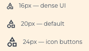
39 real Phosphor icons, token-bound. Weight maps to shape/surface personality; size and color always come from tokens.
Component Library
39 patterns, six categories, every state specced
Grouped by category rather than one page per component — each ships every interaction state (Default/Hover/Pressed/Focused/Disabled) across Small/Medium/Large, all reading the same shape and elevation lookup tables above.
- Button (Primary/Secondary/Danger)
- Icon Button
- Link
- Button Group
- Split Button
- Text Input · Textarea
- Checkbox · Radio · Switch
- Select · Combobox · Date Picker
- Slider · File Upload
- Credit Card · Phone Number fields
- Tabs · Breadcrumbs
- Pagination · Stepper
- Menu · Dropdown · Command Menu
- Sidebar · Top Navigation
- Badge · Alert · Toast
- Progress Bar · Spinner
- Tooltip · Skeleton
- Card · Accordion
- Dialog · Drawer · Popover
- Avatar · Divider · Tag
- List Item · Empty State
- Table · Tree View · Timeline
- Calendar · Data Grid · Charts
Accessibility
WCAG 2.2 AA, built in
Every ratio below is computed from the actual tokens in this file.
action/danger fails AA for normal body text in Light mode — pair error text with an icon.
Results & Reflection
Turn heads, not screws
One foundation, 39 patterns across six categories, and a token model built to be read by people and coding agents alike — replacing what used to be a separate library per visual style.
Foundations before components
Every component page reads from the token pages built earlier — Shape’s lookup table, Elevation’s paired z-index, Motion’s personality tiers. Building Actions first would have meant re-deriving all of it mid-stream.Writing every decision as a resolvable token made the file legible to coding agents, not just designers
Reject native features that don’t ship
Figma’s native Glass effect looked better in the editor but had no Dev Mode export — using Background Blur + translucent fill instead meant the spec was never aspirational.
Compute, don’t estimate
Running real contrast math against the actual token values (not eyeballed) surfaced the one pairing that would have shipped as an accessibility bug.
Next